heloisa guarda
Improving navigation in a data-heavy product through User Experience Design
The goal was to redesign the interface of an existing MDM system, utilizing user experience design.
The previous system was complex, ambiguous and took sales representatives many hours to explain its usage to new buyers.
After the first meetings with stakeholders and hearing the expectations for a new version of the product, I structured the path I would follow:
1.
Research
2.
Structure
3.
prototype
1. Research: Getting familiar with the subject
Research
Unveiling market trends and user needs
At the beginning, I sought to understand the business and how the system delivered value to its users through conversations with stakeholders and secondary research (or desk research).
Research
Competitive benchmarking: Setting the bar for Innovation and Usability
I also aimed to understand what the competitors were doing and how they met their customers' demands through services with an MDM. This was essential to visualize the product in practice and start materializing some ideas.
Research
Interviewing key clients and employees
After gaining a basic understanding of the business in question, I interviewed 11 users with varied profiles, aiming to understand their needs and expectations regarding the product.

2. Product Structuring
Product Structuring
Defining the Key drivers of user behavior
MDM is a management system that can cater to countless personas. In this project, we identified three main user profiles and used them to guide the development of the workflows, as well as the different views and functionalities of the system.
Product Structuring
Structuring information for optimal user engagement
Since it is a B2B product, it contained a considerable volume of information for users to consume. Therefore, I mapped the system architecture and understood the various areas of the system and how they communicated with each other.
Product Structuring
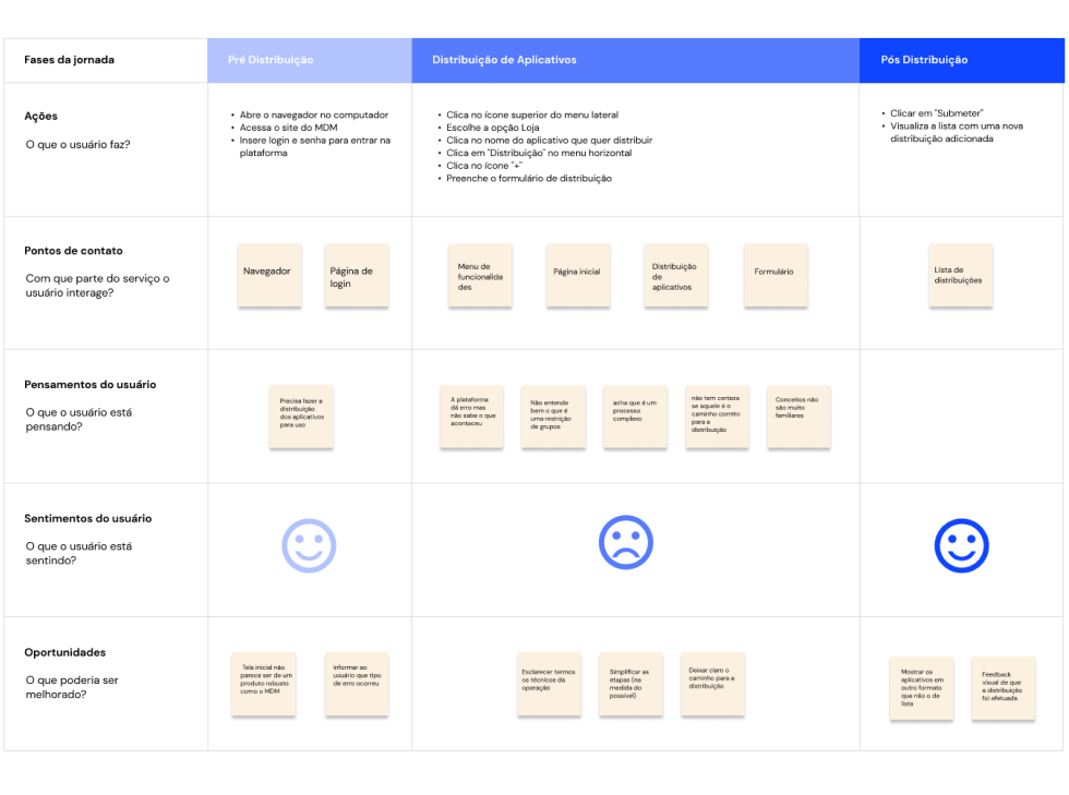
Visualizing the User's path through Journey mapping and user flow mapping
After understanding the overall structure of the system, I proceeded to grasp each existing part of the system and identify what could be improved in the current experience by mapping out some user journeys and flows.
3. Ideation and prototyping
Prototyping
From sketches to High-fidelity Figma prototypes
With the content laid out and the strategies outlined and approved, I sketched the screens for the new MDM. The initial drawings were done with paper and pencil, as it allowed for greater agility. After the ideas presented in the sketches were approved, I prototyped the screens and components using Figma.

Prototyping
Establishing a visual language for the product
Since I was dealing with a large system with many areas, I felt the need to work with components and variables in Figma, and I consolidated all of them into a style guide. This guide became a deliverable and eventually a standard to be followed in other projects within the company.

At the end of the process, what we had was a product with new and user friendly navigation flows, plus an appealing professional visual:


4. Business results
Business results
36% reduction on support tickets
Approximately 70% of customer support calls were related to navigation issues with the old MDM system, which had a poor user interface.
Business results
7 to 8 weeks economy per software development project
By standardizing the visual design process with a style guide, design time for incoming projects was reduced by 50-70%, leading to a significant 2-month time savings per project. This efficiency boost accelerated projects completion and cut costs.